
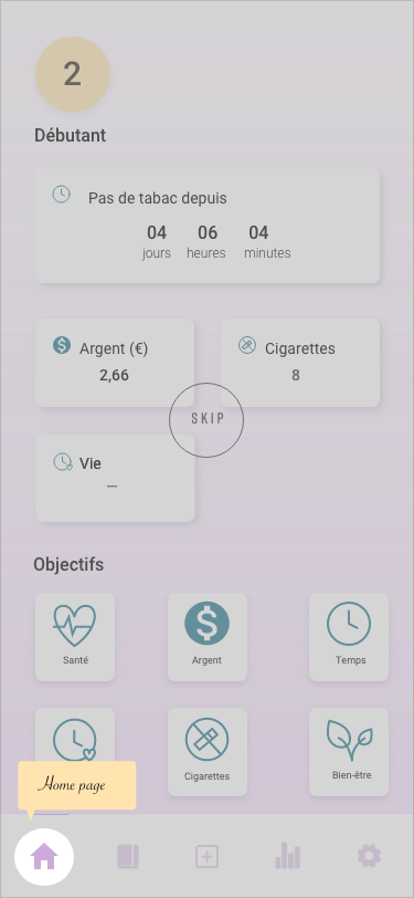
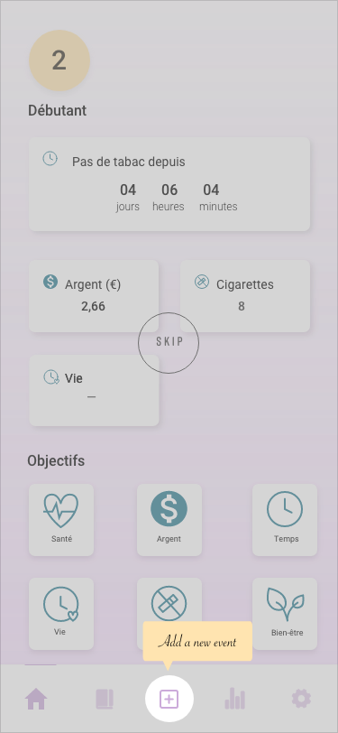
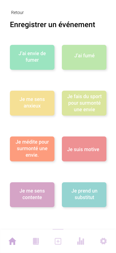
‘Stopper’ is an application-based to encourage and help users quit or reduce tobacco, so the motivation to use this app is for users who want to leave or change their habit and relation to smoking. The stopper app is a tool that users will use to motivate them to quit tobacco and guide them in the process. The idea’s that users use the app to note their feelings and frustrations. The app counts with different sections that allow the user to see their progress and look at what they did. The app's main task is to add an event where they can see the agenda section and see their progress.
I used some human factor principles and hook principles that guide me in my design decisions:
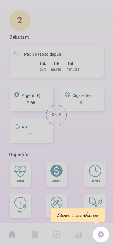
Trigger: This app is focused on all the people that feel anxious, angry, lost, mentally exhausted on their way to quitting smoking (external). The user will receive notifications from the app, but just relevant messages to avoid users become desensitised.
Action: This app acts like a schedule, where the user will explain their feelings and note their daily amount of cigarettes.
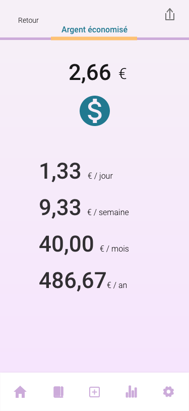
Reward: Over time, the users get a higher level of status (competencies), also improving their knowledge about the advantages et al. l the changes that their bodies are having (resourceful), also they have the wallet, where they can see the savings.
Investment: In every note that the user does, explaining their experience, they are available to share the experience with their friends, and at the same time, more users get to know from the app.
Familiarity: To help users find items on the screen, I place them inside sections that they will be familiar with, such as the menu bar. Inside the menu bar, I remember the main navigation along with their account section. The icons are simple cutouts of what they represent and labelled.
Physical Ergonomics: The sizes of the buttons and the clickable elements are appropriated to a mobile device, making a comfortable experience for the user, as they are not small or difficult to click.
Consistency: The elements that appear on more than one page have the same convention across all the details of the UI, follow the same design, location and work the same way to simplify the experience to the user, and make elements simple to recognise and localise.
The current onboarding asks for personal information about the user (like their name, number of cigarettes per day and price) to create their profile, but to improve the user's first impression, decided to show users the app's benefits, educates them about the functions, and gathers profile information to deliver personalised content and notifications.
After the feedback that users gave me, I realised that the app is kind of intuitive, as all the users find its primary purpose. They see the app as easy to use and understandable. Also, they think it is exciting and valuable to follow their progress and improvement. For the design part, the comments that I got are :
- Increase the size of the words.
- Reduce the white spaces.
- Change some elements where the colours do not have too much contrast (lavender and turquoise together) as the progression bar.
So I crease several words also to reduce the white space between elements besides increasing the size of the other elements as icons. For the colours, I decided to continue with the lavender colour, as it’s the main one and maintains the turquoise, but just for the buttons, I change to a dark blue in other elements. For the features that turquoise and lavender go together, I changed the turquoise for a yellow one to have more contrast between the colours.
In addition to that, I also made a slight improvement for the user. Now, each time that opens the applications, a motivational sentence appears on the screen.


In the first screen, after the feedback got by users I decided to introduce more elements as it seemed a bit empty.
The second screen it’s a resume of the application, just to let the user know what are the benefits of using the stopper.
The third screen, it’s just a pop-up message to let the user know that they will have to give us some
personal information.