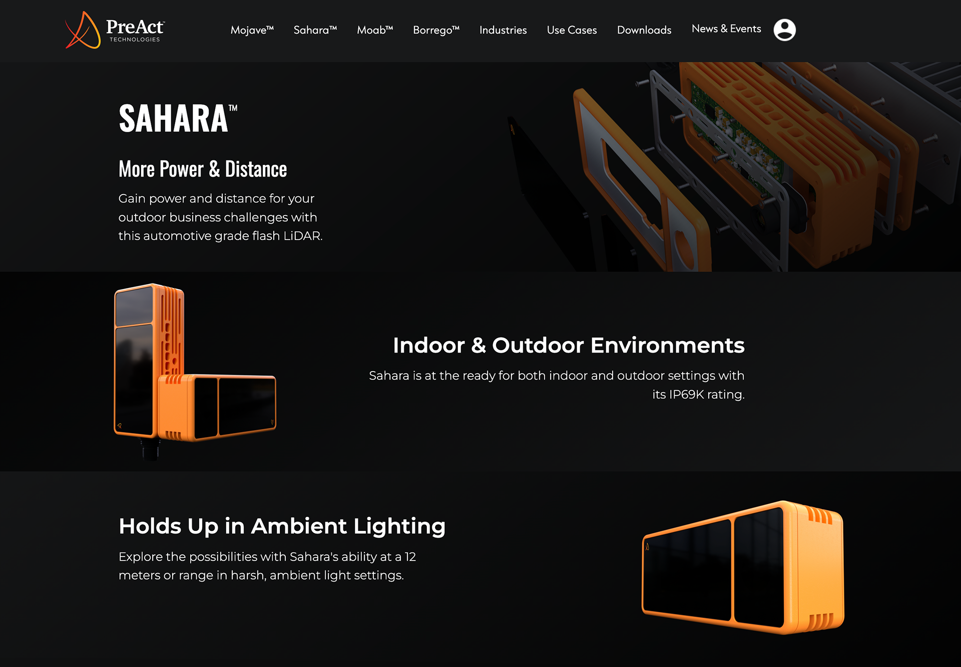
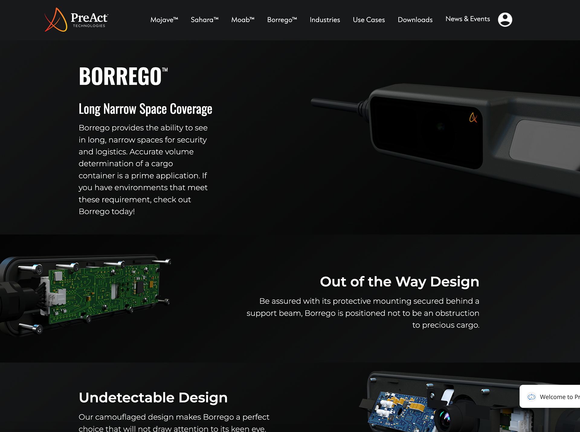
The redesign of PreAct Technologies’ website was driven by its recent acquisition of Gestoos, with the objective of integrating the two companies' identities and offerings. To achieve this, I started by thoroughly analyzing the brands and their target audiences, focusing on highlighting PreAct’s innovative lidar technology and Gestoos’ AI capabilities.
The color palette was strategically chosen to reflect the technological sophistication of both brands. Dark tones were paired with bright accents to convey innovation and professionalism while maintaining a modern look. The typographyuses clean, sans-serif fonts that ensure readability across all devices while complementing the cutting-edge nature of the brand.
In terms of visual content, high-quality imagery and diagrams of the products were used to illustrate the complex technology in an accessible way. This ensures that both technical and non-technical users can easily engage with the content. The layout prioritizes user experience (UX) by organizing the content logically, with clear navigation that adapts across multiple devices to enhance accessibility.
The site’s structure was designed to improve usability, featuring distinct sections for different product lines and technologies. The navigation was simplified to allow users to quickly find relevant information while maintaining consistency across all pages. Additionally, I focused on SEO optimization and mobile responsiveness to enhance the website’s visibility and accessibility, ensuring it works flawlessly on all platforms.
Designed in Figma and built in Webflow, this redesign effectively merges the brand identities of PreAct and Gestoos, offering a cohesive and visually engaging experience that supports the company’s long-term business objectives.
Some of the requirements I have follow:
Performance:
Assess the website's loading speed, as this can impact user experience.
Homepage Design:
Look for a clean and organized layout.
Check for a clear value proposition or message.
Assess the ease of navigation, ensuring that users can quickly find key information.
Navigation:
I checked the website's menu structure and how easily users can find information.
Evaluation the use of call-to-action elements.
Visual Appeal:
Evaluate the use of visuals, images, and multimedia.
Check for a consistent color scheme and brand elements.
Consider the use of white space for readability and overall aesthetics.
Content Quality:
Assess the clarity and relevance of the written content.
Look for a balance between text and visuals to enhance engagement.
Contact and Interaction:
Check for clear contact information and communication channels.
Assess if there are interactive elements or forms for user engagement.
Consistency:
Look for consistency in design elements across various pages.Ensure that the design aligns with the overall brand identity.


Responsiveness:
Verify if the website is responsive, adapting well to various screen sizes and devices.
Here are some well-thought-out visual details from a UX/UI perspective:
Consistent Branding: The use of a consistent color palette, primarily dark tones with bright accents, helps reinforce the brand's identity and creates a professional look.
Clear Visual Hierarchy: Bold headings and strategic use of white space guide the user’s attention naturally through the content, improving readability and focus.
Responsive Design: The website adjusts seamlessly across devices, providing an optimal user experience regardless of screen size.
Effective Use of Imagery: High-quality product images and well-placed visuals enhance user engagement and help clarify complex technology.